The roof color you choose changes the whole exterior
- Most asphalt shingles are blended granule colors, so they read differently from a paint chip.
- Neutral options like charcoal, gray, weathered wood, and bark tones are the safest all-around picks in the U.S.
- Color affects curb appeal immediately, while heat performance depends more on climate, attic ventilation, and product type.
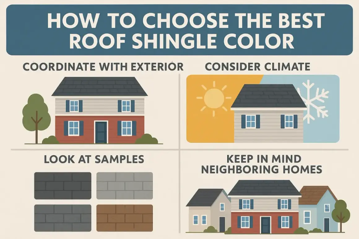
- Always test samples outside, because sunlight, pitch, and nearby materials change the final look.
- Check HOA rules, stock availability, and whether your chosen line includes cool-roof or solar-reflective options.
Why most asphalt shingles look like blends
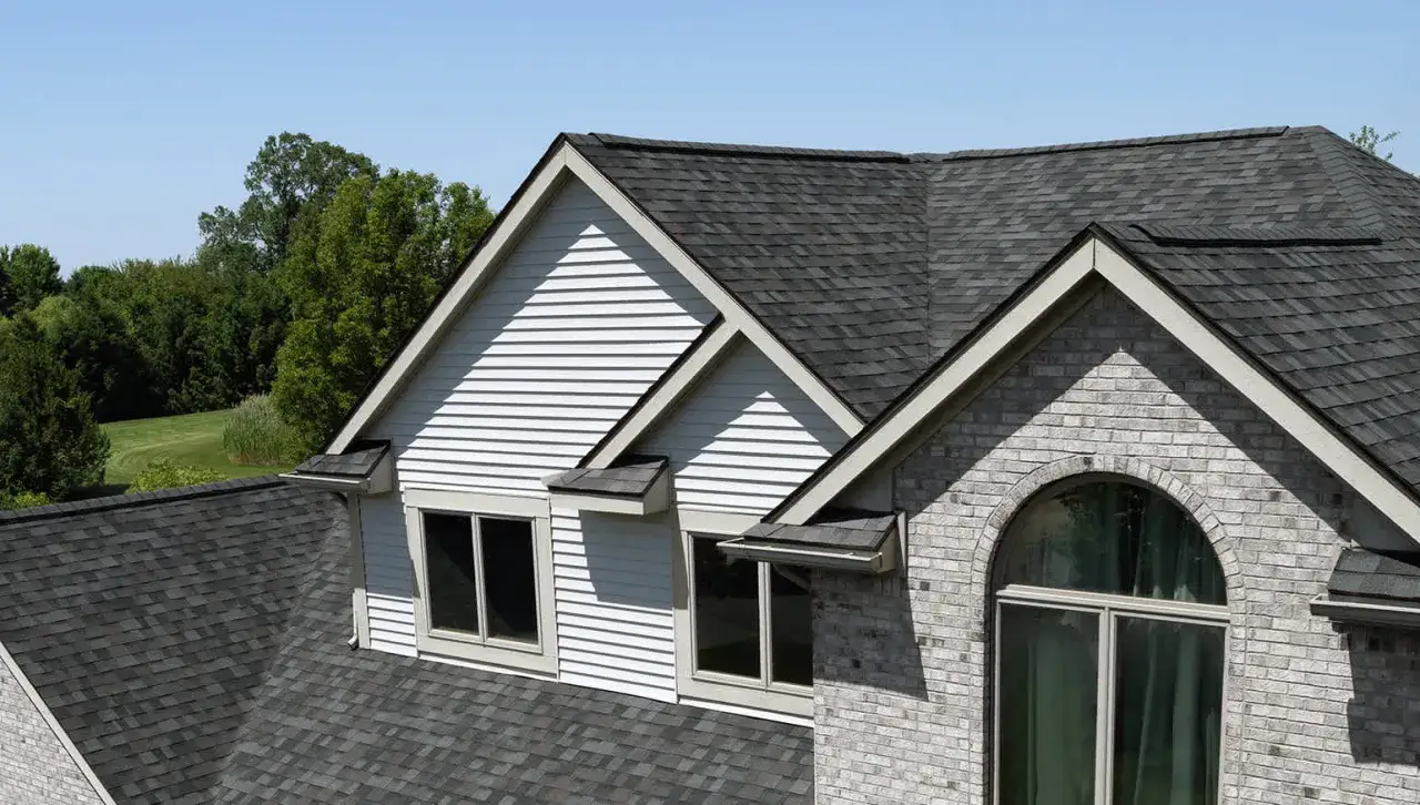
Roof shingles rarely look like a single flat color because the surface is built from ceramic-coated granules in mixed tones. That blend is intentional. It gives the roof depth, hides small dirt marks better than a uniform finish, and helps the material read naturally from the street instead of looking painted on.
I also think it explains why the same shingle can look darker, warmer, or cooler depending on the light. A bundle that looks like simple gray in the yard may read almost black on a steep roof, or shift brown once it is next to brick or warm siding. Architectural shingles usually make this effect stronger than basic 3-tab shingles because they have more shadow lines and a more dimensional surface.That layered look is why the broad families matter more than any single swatch, and it leads directly to the main palettes homeowners see in the market.
The color families homeowners choose most often
Manufacturers such as GAF show shingles in shades of blue, red, gray, green, brown, and more, but in real projects I still see neutrals win most of the time. The reason is simple: they are easier to coordinate with siding, stone, brick, gutters, and trim, and they age more gracefully when the rest of the exterior changes later.
| Color family | Visual effect | Best fit | Watch for |
|---|---|---|---|
| Black and charcoal | Sharp, clean, high contrast, often modern or formal | White siding, crisp trim, contemporary homes, classic colonials | Can feel heavy on low roofs or on homes that already use very dark siding |
| Gray and pewter | Balanced, calm, versatile, easy to pair with other materials | Blue siding, white exteriors, stone, cool-toned brick | May look flat if the exterior already lacks contrast |
| Brown and weathered wood | Warm, natural, familiar, slightly rustic | Brick, tan siding, craftsman homes, traditional suburban houses | Can look busy if the facade already has several warm tones |
| Beige, sand, and taupe | Soft, understated, blended, easy on the eye | Ranch homes, coastal homes, lighter stucco, mellow exteriors | Sometimes too subtle if the owner wants a stronger roofline |
| Green, blue, and red accents | Distinctive, expressive, more personality-driven | Cottages, rustic homes, custom projects, homes with a clear design theme | Availability is narrower, and resale appeal depends on the neighborhood |
| Slate-like blends | Dimensional, upscale, visually rich without looking flashy | Larger roofs, traditional homes, homes with stone or mixed-material facades | Often costs more and can look different by manufacturer |
If you want the safest resale choice, I usually start in the charcoal-gray-brown range. If you want more personality, I still recommend moving one step warmer or cooler rather than jumping straight to a bright statement color. The roof is too large to treat as an accent stripe, so restraint usually ages better.
Once you know which family fits your taste, the real test is how that family behaves against your own siding and trim.
How to choose a shade that fits the house
When I walk a homeowner through this choice, I start by asking what the roof should do visually. Should it disappear into the house, frame it, or become a feature? That answer narrows the field immediately, because a roof color that works on a brick colonial may feel completely wrong on a small ranch or a modern farmhouse.
CertainTeed’s ColorCoach uses a 60-30-10 exterior rule, and I think that is a useful way to think about roof color too. The roof usually behaves like a supporting color rather than the star of the show, so it should work with the siding and trim instead of fighting them.
- Warm brick or beige siding usually works best with weathered wood, bark, brown-gray blends, or soft tan tones.
- Cool gray siding or stone often looks strongest with pewter, slate, charcoal, or other cooler blends.
- White exteriors can handle black, charcoal, soft gray, or even a muted red if the home has enough character.
- Blue or coastal palettes often pair well with silver-gray, driftwood, or softened charcoal.
- Farmhouse and craftsman homes usually benefit from medium-contrast roofs that feel grounded rather than loud.
I also advise checking the fixed parts of the exterior before you look at any sample card. Gutters, window frames, stone, brick mortar, shutters, and front door color all matter more than people expect. If the roof clashes with one of those permanent elements, the whole exterior can feel unsettled even if the shingle itself is attractive.
After the visual match comes the practical side: color is not just style, it can also affect how the roof handles heat.
Heat, cool-roof options, and climate tradeoffs
Darker shingles absorb more solar energy than lighter ones, so roof color does have a real thermal effect. That said, I would not oversell it. Attic ventilation, insulation, roof deck design, and the shingle product itself usually matter more for comfort than color alone.In warmer parts of the United States, I pay closer attention to cool-roof or solar-reflective shingles when they are available in the chosen style. The good news is that these products are no longer limited to pale, flat-looking colors. Some lines now offer richer tones while still reflecting more solar energy than a standard dark roof.
In colder climates, roof color is usually more of an appearance decision than an energy decision. Snow contrast, neighborhood style, and the way the roof frames the house tend to matter more than trying to squeeze a small thermal gain out of a lighter shade. If a homeowner wants a dark roof in a hot region, I usually say that is still possible, but it should be paired with solid attic ventilation and realistic expectations.
The easiest way to avoid regret is to compare the likely failure points before you buy.
Mistakes that make a good color look wrong
Most bad roof-color choices are not actually bad colors. They are good colors used in the wrong context, at the wrong scale, or under the wrong light. Here are the mistakes I see most often.
| Mistake | Why it happens | Better move |
|---|---|---|
| Choosing from a tiny sample indoors | Artificial light makes shingles look flatter and darker than they will on the roof | View full samples outside, in direct sun and shade |
| Ignoring undertones | Warm and cool surfaces are mixed together without a plan | Match warm roofs to warm exteriors and cool roofs to cool exteriors |
| Focusing on one material only | The roof is picked to match the siding but not the brick, stone, or trim | Check the full exterior as one composition |
| Going too trendy | The color looks exciting in a catalog, then feels dated quickly | Stay close to neutral, then add personality through blend and contrast |
| Forgetting future repairs | The exact color code is not recorded | Keep the product line and color name for later matching |
Minor variation from bundle to bundle is normal, so a good installer should blend bundles during installation to avoid obvious patching. That is especially important on large roofs, where even small inconsistencies can stand out from the curb. If the roof is being repaired rather than replaced, having the exact color code matters even more than the general color name.
If you want to avoid those mistakes entirely, a short, structured decision process works better than browsing swatches at random.
A quick way to narrow the field in one afternoon
- Pick one safe neutral, one warmer blend, and one slightly bolder option.
- Set each sample against the siding, trim, brick, and gutters outdoors.
- Look at the samples from curb distance, not just arm’s length.
- Check them in morning light, midday sun, and late afternoon shade.
- Confirm the exact color name, product line, and local availability before you fall in love with a sample that is hard to get.
I usually tell homeowners to trust the sample that still looks right after a few minutes outside, not the one that only looks good in the showroom. That is the difference between a roof color that photographs well and one that actually lives well on the house.
By the time you reach this point, the final choice should be obvious enough that you are validating it, not second-guessing it.
What I would keep in mind before ordering in 2026
In 2026, the smartest roof-color decisions are still the least dramatic ones. Neutral blends, especially charcoal, gray, weathered wood, and brown-gray combinations, remain popular because they are easy to live with and easier to coordinate with the rest of the exterior. That does not mean a bolder roof is wrong, but it does mean the home has to support it.
If I were ordering shingles today, I would ask for full-size samples, verify the exact color code, check whether the line has a cool-roof option, and make sure the color works with the house in full daylight. I would also confirm that the chosen shade is available in the needed quantity from the same batch, especially on larger projects where consistency matters. A roof is too expensive to guess at, and the best result usually comes from a color that feels calm, balanced, and right from the street.
When the roof still looks good after you step back, change the angle, and let the sunlight hit it, you are probably looking at the right choice.