
The cleanest answer is usually the one that follows the room
- In a rectangular room, I usually start with the longest uninterrupted wall or sightline.
- Natural light matters, but it works best as a tie-breaker when the room shape gives two good options.
- Hallways almost always look better when the planks run lengthwise.
- Diagonal and herringbone layouts can solve awkward rooms, but they add labor and waste.
- Product instructions still matter, especially for floating or glue-down systems.
How I choose the direction in a typical room
I start with the biggest uninterrupted sightline, then I check whether the room gets its strongest daylight from one side or from the end. Unlike some wood-floor rules, LVP orientation is usually about sightlines and transitions, not structure. If the room is rectangular, the cleanest answer is usually to run the planks along the longest wall or lengthwise through the room.
- Measure the room and identify the longest clean run without major interruptions.
- Stand at the main entry and look at the floor the way guests will see it first.
- Check the strongest daylight source and note where the shadows will fall.
- Look at every doorway, hallway, and adjoining room before you commit.
If two directions look equally good on paper, I choose the one that gives me cleaner cuts at the perimeter and fewer awkward pieces at the transitions. That is the point where layout stops being theoretical and starts being practical. Once that baseline is set, the next question is whether the room’s shape should override the light.
Why the longest wall usually wins
Running planks parallel to the longest wall usually makes a room feel longer and more proportioned. In a bedroom, living room, or dining room with clean edges, that choice also gives the eye a stable line to follow, which is why the floor tends to look more intentional even when the material itself is purely practical.
Fewer awkward cuts is the second big reason I like this direction. When the layout follows the longer dimension, the end cuts often stay more consistent, and the installation looks less pieced together. I still check the actual room, though, because a strong fireplace wall, a long bank of windows, or a dominant entry path can justify a different orientation.
In narrow spaces such as hallways and long kitchens, lengthwise usually looks right because it stretches the space instead of chopping it up. That brings the eye forward, which is usually what you want in a passage rather than a destination room. From there, light becomes the next filter, not the first one.
When natural light should influence the layout
Natural light matters because side light can make plank seams, embossing, and texture more visible. If the room has large windows on one wall, I often look at how the boards will catch the light at different times of day. In many homes, running the planks in the same direction as the primary light source softens those lines and gives the floor a cleaner read.
That said, I do not let light overrule everything. If the room is narrow, oddly angled, or tied to a hallway, I usually keep the structural flow of the space ahead of the light. A floor that follows the windows but fights the room shape can still feel wrong the moment you walk in.
This is where a sample board helps more than theory. Put a few planks on the floor, look at them in morning light and late afternoon light, and notice whether the seams disappear or start to stand out. A matte finish is usually more forgiving than a glossy one, but the room itself still decides the better direction.
Once the daylight question is settled, the next challenge is keeping the layout consistent across doorways and open spaces.
How hallways and open plans change the answer
Hallways are the easy case: run the planks the long way. That keeps the passage from feeling sliced into short segments and usually makes the installation simpler to execute. Open plans are less obvious because one decision can affect the kitchen, dining area, and living room at the same time.
When I am dealing with a connected layout, I try to keep one direction through the main shared space whenever possible. The floor reads as one surface, not a series of separate patches, and that usually looks better in homes with open kitchens and living areas.
| Space | Direction I usually favor | Why it works |
|---|---|---|
| Hallway | Lengthwise | Elongates the passage and reduces the chopped-up look |
| Rectangular living room | Parallel to the longest wall | Makes the room feel larger and keeps cuts cleaner |
| Open-plan great room | One continuous direction across the main area | Creates visual flow between zones |
| Room with strong side light | Along the light source if the shape allows it | Softens seam visibility and shadow lines |
| Odd-shaped room | The direction that minimizes tiny cuts | Protects the finished look more than strict symmetry |
A transition is not a failure; it is often the cleaner solution when a doorway would otherwise force a bad compromise. When the shape and the light pull in different directions, I let the broader floor plan decide. That is usually the difference between a room that feels intentionally designed and one that looks like each section was solved in isolation. From there, the last major choice is whether you stay with a straight run or move into a more decorative pattern.
Straight lay, diagonal, or herringbone
For most homes, a straight lay is still the smartest choice. It is the easiest to plan, the most forgiving to install, and the least likely to create awkward waste. Diagonal and herringbone layouts can look excellent, but they earn that look by demanding more planning, more material, and more patience.
The percentages below are planning allowances, not hard rules, but they are useful when you are budgeting for cuts and mistakes.
| Pattern | Best use | Main tradeoff | Typical extra material |
|---|---|---|---|
| Straight lay | Most rooms, especially rectangular ones | Least dramatic, but clean and efficient | About 5-10% |
| Diagonal | Rooms with awkward angles or a stronger design goal | More cutting and more waste | About 10-15% |
| Herringbone | Statement spaces and larger rooms, if the product is made for it | Highest labor and layout complexity | About 15-25% |
I would not choose a diagonal layout just because it sounds more interesting. I choose it when it solves a real visual problem, like a room with off-square walls or a layout that would otherwise leave me with awkward slivers. Herringbone is even more specific: it can be beautiful, but it changes the job from a standard plank install into a design-led project.
If your goal is a floor that looks calm and timeless, the straight layout usually wins. If your goal is to disguise an awkward room or create a stronger architectural statement, the more complex pattern can be worth the extra cost. That is also where mistakes become more expensive.
The mistakes that make a good floor look wrong
The most common mistake is picking direction before checking the actual sightline. A room can look square until you measure it, and a wall that seems like the obvious starting point can turn out to be the one that makes every cut look slightly off. I also see people commit too early to matching the floor direction in every room, even when a transition strip would make the overall house look cleaner.
- Ignoring the main sightline and letting the closest wall decide the layout.
- Forcing one direction through every space when a doorway or transition wants a reset.
- Skipping a dry layout and discovering the problem after the first rows are locked in.
- Choosing light direction over room shape when the room is narrow or heavily angled.
- Ordering too little material for cuts, damaged boards, and layout changes.
- Assuming direction can fix a bad subfloor, when flatness and prep matter far more.
Shaw Floors notes that installers should determine the starter wall and direction before the first row goes down, and that luxury vinyl should be installed in a climate-controlled environment. I think that advice is practical because direction only matters once the substrate is ready and the room is stable. If the floor is not flat or the room conditions are off, even the best orientation will not save the result.
The safer habit is simple: dry lay, step back, and look at the floor the way you will actually see it every day. That last check leads naturally into the checklist I use before I cut anything.
The layout check I use before the first plank
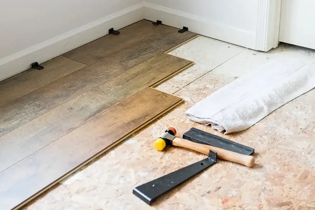
Before I commit, I run through a short process that keeps me from guessing. It takes a little time, but it is cheaper than discovering the wrong direction after the first room is half done.
- Place sample planks in the room and view them in morning and afternoon light.
- Measure the longest uninterrupted run and mark it with a chalk line.
- Dry lay at least 2 to 3 rows so I can see the seam pattern and the end cuts.
- Check how the floor will meet each doorway, hallway, and adjoining room.
- Confirm the product instructions before I lock in the starter wall, including expansion-space requirements.
- Order extra material: 5-10% for a simple straight lay, more for diagonal or patterned layouts.
If the room still looks balanced after that dry run, I know the direction is probably right. If the layout feels busy, cramped, or awkward from the doorway, I adjust before the real installation starts. That is the simplest way I know to make an LVP floor look deliberate instead of improvised.
If I had to reduce the whole decision to one line, I would run the boards parallel to the longest clean sightline unless the hallway, light, or transitions clearly argue for something else. That keeps the floor calm, the cuts simpler, and the finished room easier to live with.