Roof color does more than finish a house; it changes how the whole exterior reads from the street. I usually treat it as a balancing act between style, climate, and the fixed elements around the roofline, especially siding, brick, trim, and gutters. Here I break down the shingle color families available in the U.S., how I would match them to different homes, and what really matters before you sign off on a final shade.
The practical takeaways
- Most homeowners still end up choosing charcoal, gray, brown, weathered wood, or another blended neutral because those shades coordinate easily.
- The roof should be chosen with siding, brick, gutters, and windows in mind, not in isolation.
- Light or reflective shingles can help in hot, sunny climates, while darker roofs still make sense in colder regions and on many traditional homes.
- The same color name can look different once it is installed because of granule blend, roof pitch, sunlight, and nearby materials.
- Full-size samples in daylight are far more reliable than a phone screen or a tiny swatch.
The color families homeowners actually choose
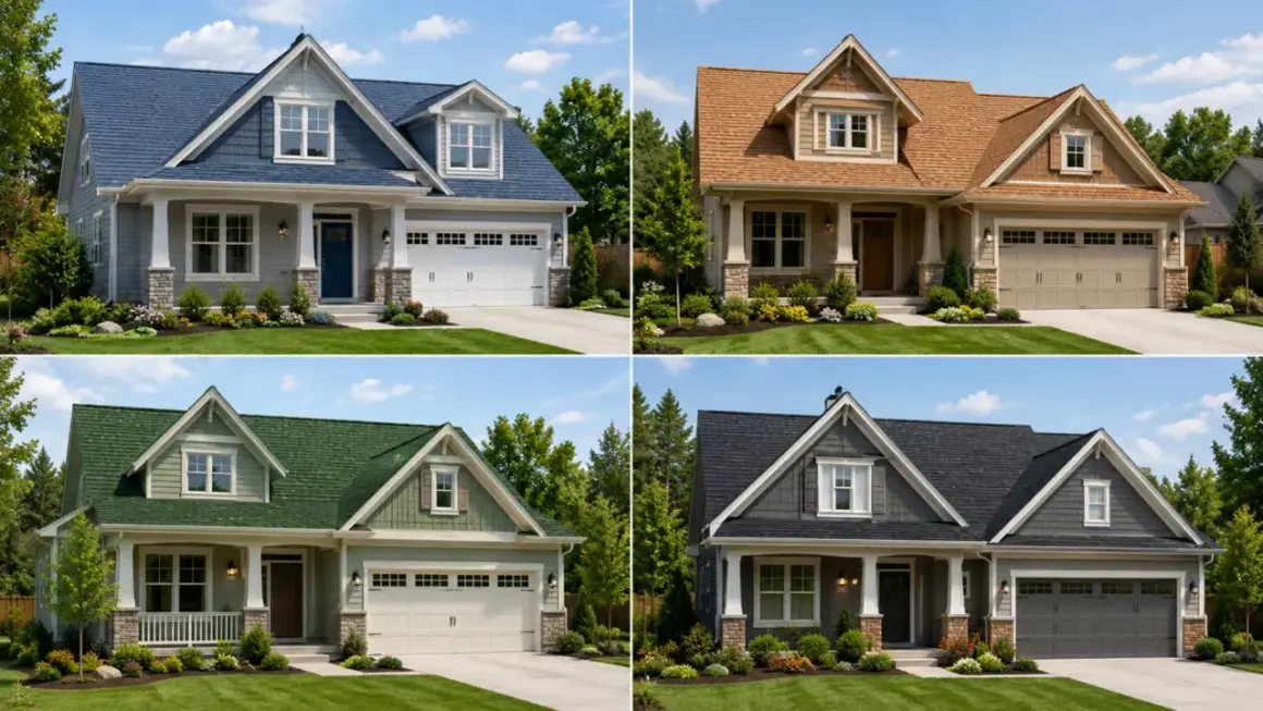
As of 2026, the palette is broader than it used to be, but most asphalt shingles still fall into a few dependable families: black, charcoal, gray, slate, brown, tan, weathered wood blends, and a smaller set of greens and blues. Most homeowners are not choosing a single color so much as a visual temperature. They are deciding whether the roof should feel crisp, warm, muted, or deliberately distinctive.
I also pay attention to the surface itself. Architectural shingles usually give color more depth because the layered profile creates shadow and variation; that is why a “gray” roof can still read cool, warm, or slightly brown depending on the granule blend. A flat, basic shingle tends to look more uniform, which can be fine, but it gives you less nuance to work with.
| Color family | How it usually reads | Best fit | Main tradeoff |
|---|---|---|---|
| Black and charcoal | Sharp, formal, high contrast | White siding, modern trim, brick facades, black gutters | Can feel heavy on a small house |
| Gray and slate | Neutral, balanced, versatile | Mixed exteriors, stone, cool-toned siding | Can look flat if the rest of the house is also gray |
| Brown, bark, and weathered wood | Warm, traditional, grounded | Beige, tan, red brick, bronze-style gutters | Can clash with very cool siding colors |
| Tan and beige blends | Soft, lighter, more relaxed | Farmhouse looks, cream siding, sunlit homes | Shows dirt and staining more readily |
| Green and blue accents | Distinctive, styled, less common | Cottages, coastal homes, homes with stone or cedar | Narrower availability and a stronger style commitment |
The practical pattern is simple: if you want the roof to recede, stay in the gray and brown range. If you want it to frame the house and create stronger contrast, go darker or more saturated. That leads directly to the bigger question of how the roof works with the rest of the exterior, especially gutters.
How to match roof color to siding, brick, and gutters
I start with the materials that are expensive or hard to change. Siding, brick, stone, window frames, and gutters already define the house, so the roof needs to support them rather than compete with them. This is where a lot of bad choices happen: someone loves a shingle color on its own, but once it is placed next to the gutters and trim, the whole exterior starts to feel disconnected.
| Exterior situation | Color direction I would test first | Why it works |
|---|---|---|
| White or cream siding with black gutters | Charcoal, black, or deep gray | Creates a clean frame and keeps the roofline crisp |
| Red brick with light trim | Weathered wood, slate, medium brown, or mixed gray | Respects the brick without fighting its undertones |
| Beige or tan siding with bronze-style gutters | Barkwood, driftwood, or mid-gray | Stays warm without making the house look washed out |
| Gray siding or stone | Warmer browns or blended grays | Prevents the exterior from becoming one flat monochrome block |
| Dark trim, black windows, or black gutters | Medium roof tones or layered blends | Stops the top edge from feeling too heavy |
Gutters matter more than people expect. Black gutters can disappear into a charcoal roof and make the eaves feel slim and modern, but the same combination can look too dense on a small home. Bronze or copper-tone gutters usually pair better with brown, wood-tone, or tan shingles, because they keep the exterior warm instead of creating a hard visual break. Once the roof is balanced with the rest of the house, the next question is whether the color also makes sense for the climate.
Dark and light shingles do different jobs
The U.S. Department of Energy notes that a cool roof reflects more sunlight and absorbs less solar energy, and that a reflective roof can stay more than 50°F cooler than a conventional roof on a sunny summer afternoon. EPA also points out that steep-slope cool roofs include asphalt shingles surfaced with light or cool-colored granules, and that these products can reduce indoor heat in residential buildings. In non-air-conditioned homes, the temperature drop can be meaningful enough to notice, not just measure.
That does not mean light is always best. In colder climates, a darker roof can still be a sensible choice, especially when the house benefits from a warmer visual tone and the attic is already well insulated. Color is not a substitute for insulation, ventilation, or attic airflow. It influences heat gain, but it does not replace the basics.
I also think it is worth separating appearance from performance. Some modern reflective shingles are designed to look darker than a typical cool roof while still performing better than a conventional dark shingle. That matters if you want a stronger exterior look without giving up every energy advantage. The real decision is not simply dark versus light; it is whether the product line gives you the look you want with the performance your climate calls for.
- Choose lighter or reflective shingles if the home is in a hot, sunny region, the attic runs warm, or cooling bills matter more than winter heat retention.
- Choose darker shingles if you want stronger contrast, the architecture looks better with a heavier roofline, or the home sits in a colder region.
- Check local code and HOA rules, because some neighborhoods limit unusual colors or steer homeowners toward reflective roofing.
The catch is that two roofs with the same color name can still look different once they are installed, which is why I never stop at the label.
Why the same color can look different on two roofs
Color names are only a starting point. What really determines the final look is the granule blend, the roof pitch, the direction of the light, and the materials surrounding the roof. A “gray” shingle may carry brown undertones on one house and blue undertones on another. A roof that looks calm in a showroom can look far darker once it is on a steep pitch under strong afternoon sun.
Granule blend matters because it is the mix of ceramic-coated mineral granules that creates the roof’s final tone and texture. That is why mixed blends usually age more gracefully than a flat, single-note color. They hide minor staining better, soften small imperfections, and keep the roof from looking harsh when the light changes through the day.
- Roof pitch: steeper slopes throw more shadow, so the same shingle often reads darker.
- Sun exposure: a south- or west-facing roof will usually feel brighter and warmer than a shaded one.
- Nearby surfaces: brick, stone, gutters, and window frames change how your eye reads the shingle color.
- Viewing distance: a hand sample can look subtle up close and much bolder from the street.
- Aging: blended colors usually disguise gradual wear better than flat, uniform tones.
That is why I always insist on seeing the material in the real world before an order is finalized. Which leads to the last step I trust most.
The sample that wins in daylight usually wins on the roof
If I am choosing between two or three shades, I do not trust a website image or a tiny chip. I want full-size samples, outdoor light, and a direct comparison against the home’s fixed materials. At that point the right choice usually becomes obvious very quickly.
- Hold the sample against the siding, brick, trim, and gutter color, not just against a white wall.
- Check it in morning light and again late in the day, because shingles shift more than people expect.
- Step back to street distance so you can judge the roof as a whole surface instead of a close-up texture.
- Limit yourself to two or three candidates; too many samples make the decision noisier, not better.
- Ask the contractor for installed photos from homes with a similar style, roof pitch, and exterior palette.
- Confirm the exact product line and region, because some shades are widely sold while others are limited to certain markets.
For most homes, I end up recommending a mid-tone blend rather than the brightest or darkest option on the board. It gives you enough contrast to feel deliberate, enough texture to age well, and enough flexibility to work with gutters, siding, and trim without locking the house into one loud visual statement. If you are deciding between charcoal, weathered wood, and brown, the sample that still looks balanced from the street is usually the right roof.